
The
East Hampton Star February 16, 2006
Opinion:
A
Painter Picks His New York
Lewis Zacks’s cityscapes on view at Nabi Gallery
By
Jennifer Landes
Fading
landscapes tinged with a mist of history and memory are the subject
matter and patois of Lewis Zacks, a painter who lives in Amagansett.
Whether he’s painting the disappearing farmland
of the East End, moody Venetian scenes, or the streetscapes of a New
York that’s long or recently gone, Mr. Zacks imbues his canvases
with a sense of loss and longing.
His paintings are part of a show called “City
Lights” at the Nabi Gallery in New York City. Once in Sag Harbor,
the gallery moved to Chelsea two years ago, where it enjoys a large
and airy two-level space. The square footage is enough to show 18
of Mr. Zacks’s works as well as the paintings of Anna Rochegova.
At first blush, the paintings seem to be an homage
to Photorealism, but the style is looser and more atmospheric. The
shading and shadowing are romantic and less precise. The artist is
not looking for postcard perfection. Often the subjects are cut off
clumsily as if taken from a moving taxicab and captured quickly. Mr.
Zacks also includes the cracked plaster and peeling paint of the signs
and buildings, avoiding a glossy commercial sheen to provide a grittier
and crumbling reality.
The repetition of so much angularity from street
sign to building corner conjures up early American modernist movements
such as Precisionism. In fact, the streetscapes look as much like
inheritors of Charles Sheeler or Charles Demuth paintings as those
of Richard Estes or Robert Bechtle. Ms. Rochegova’s works, which
have an even mistier and hazy quality, complement Mr. Zacks’s
works nicely.
The signs and their letters break up the linear
landscape, adding curves and often a pleasant fluidity. Much as Analytical
Cubism gave way to Synthetic Cubism, the exclusive emphasis on angles
can become tiresome to both artists and viewers.
And while Mr. Zacks’s memories fade, their
colors gain vibrancy. His technicolor treatment has more in common
with Miami than New York City, particularly in the gray months of
winter. Bright peach, neon yellows and blues, and blue and orange-hued
red are predominant on his palette.
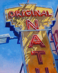
Often his signs are truncated to form what appear
to be rebuses of existential questions or, more simply, double meanings.
One sign in a painting called “Take-Out Heaven” has neon
superimposed over larger letters lit up with lightbulbs. It is cut
off at the point where “Will” and “AR” are featured.
A sign that says “Art Break” in a picture titled “Over
Easy” could be a professional assessment of the current New York
gallery scene or a meditation on a failed relationship. Some are more
playful such as a hotel sign that is cropped to read “Whirlpool
Hot” and titled “Hourly Rates.”
The paintings work best when they stay focused
on the signs and building exteriors. In two instances, Mr. Zacks adds
figures and the effect moves the entire enterprise into a kitschy
danger zone. In the print “TKTS,” an image of Matthew Broderick
and Nathan Lane as “The Producers” are in the background
behind the famous Times Square sign.
In a painting of Radio City Music Hall titled “Fred
and Rita,” the ghosts of two stars of the bygone big budget Hollywood
musical era appear to be dancing above the marquee. Since Radio City
still exists, it is understandable that Mr. Zacks may want to underscore
what he thinks is missing from its present incarnation. Nonetheless,
the effect of placing figures in these two works feels jarring and
sort of messy in the the company of the other more sterile scenes.
It is possible the artist believed he required
a physical presence to express the loss he feels in the disappearance
of these landmarks. Yet, in his painting “Java Fossil” the
remnant of “5 cent Hambe. . .” on a ghostly white background
with the Columbus Avenue corner street sign superimposed in the old-style
black on yellow coloring pretty much says it all.
Mr. Zacks tends to illustrate only select areas
of New York, such as the Lower East Side, Times Square, and Harlem.
If one were to draw a map based on the location of his signs it would
look not unlike one of Saul Steinberg’s idiosyncratic New Yorker-cover
views of the world. In his take, Mr. Zacks would keep Coney Island
and leave off the rest of Brooklyn and most of Manhattan’s East
Side, midtown, and downtown. Amagansett would probably light up in
the east.
“City Lights” will be on view until March
11.
Dans
Papers
ART COMMENTARY
Narrative: Real and Imagined at Arlene Bujese
Right
on the eve of the Hamptons International Film Festival comes an exhibit
which articulates the commonality between cinema and the visual arts:
story telling. While a case can be made that narrative exists in many
other art forms, including theatre, dance and literature, film and
particularly painting are special bedfellows. Think of the contemporary
plots and themes about quirky people who become "characters"
in works by Eric Fischl, Edward Hopper and Jim Gingrich. Landscapes
and portraits tell stories as well
And so do non-linear plots called non-narrative in film and abstraction
in art. These forms don't replicate reality nor do they follow a chronologcal,
direct cause and effect pattern (applicable to cinema)
It's what goes with what, rather than what follows what in non-linear
approaches.
Moreover, some stories take place in the realm of the unconscious,
where the viewer fills in the blanks, imagining what might be motivated
by a few suggestive images. In film, such a phenomenon may be determined
by off-screen space where we don't actually see what's happening.
With art, this same concept exists in April Gornik's seascapes, for
example, where a drama is unfolding beyond the picture plane.
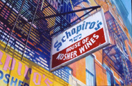
The current art show at East Hampton's Arlene Bujese Gallery features
one particular series with linear plots and off-screen space: Lewis
Zack's photorealistic oils are a trip down memory lane, especially
if we have an affinity for New York's Lower East Side.
His signs become indicators of geographical iconography, just as they
do in the film, The Last Picture Show, although its setting was obviously
not New York but small town Texas instead.
Mr.
Zack's paintings are mosaics, each image evoking part of a big picture:
a neighborhood or community. Off-screen space plays a part in Mr.
Zack's imagery as well. Because his images are in close-up devoid
of their surrounding, we can only image what lies on either side of
the particular signs. What does the neighborhood look like? Are there
people in the streets? What kind of architecture do the buildings
represent?
What are our personal associations when we see the signs? What memories do they bring up? We play a little scenario in our heads to answer the questions. Of course, there have been films about the Lower East Side which give us a wider view: Hestor Street (directed by East Ender Joan Macklin Silver) and Mean Streets, for examples. Here, there's less imagining than what takes place in Mr. Zack's paintings. Yet imagining is good, both in cinema and art. It makes us active participants in the creative process. What can be wrong about that?
![]()
![]()
![]()
If you would like to contact us Please send
an email
![]()